FigStop, a Blog for Action Figure Collector Gets UX Treatment
Sep 2018 - Oct 2018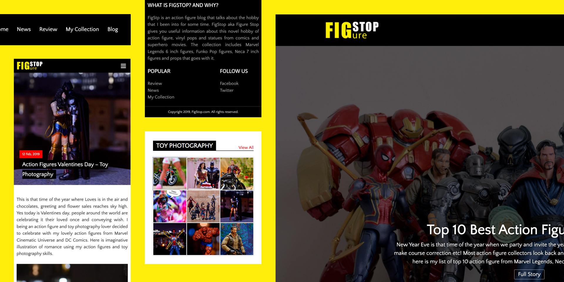
FigStop began as the dream of a passionate action figure and toy collector who wanted more than just a personal blog. The vision was clear, a platform that looked and felt like a professional news platform, but with the heart of a fan community. I been an UI/UX designer for over a decade, so I put my professional experience to good use. As with any UI design project I had few checkpoints i.e. define, research & analyse, design, develop and launch.
Research & Discovery:
I skipped the “Research & Discovery” phase as the blog was designed for me, “YEAH IT’s FOR ME” I am the toy collector this blog is intended for to share my passion for action figure collection hobby. I been a toy collector for over 15 years and xdiecast.com is my first diecast car collection site and its doing quite stable. So I put all my blogging and professional experience in this project to come up with a sleek looking blog that doesn’t feel like half baked job.
Objective:
The objective for this engagement were set as below after picking my mind from within:
- News blog inspired layout is a must with sleek navigation, which is playful yet functional.
- Easy-to-use WordPress integration with custom-made plugins and templates to article publishing phase easy.
- Scalable structure for adding new categories like reviews, store visits, toy photography and unboxing etc.
Wireframe:
Every great design starts with structure. For this project, the process began with low-fidelity wireframes, focusing purely on layout, hierarchy, and user flow. These early drafts acted as a blueprint, allowing us to refine navigation and content placement without being distracted by colors or imagery. I showed these wireframes to few collector buddies to get initial feedback.
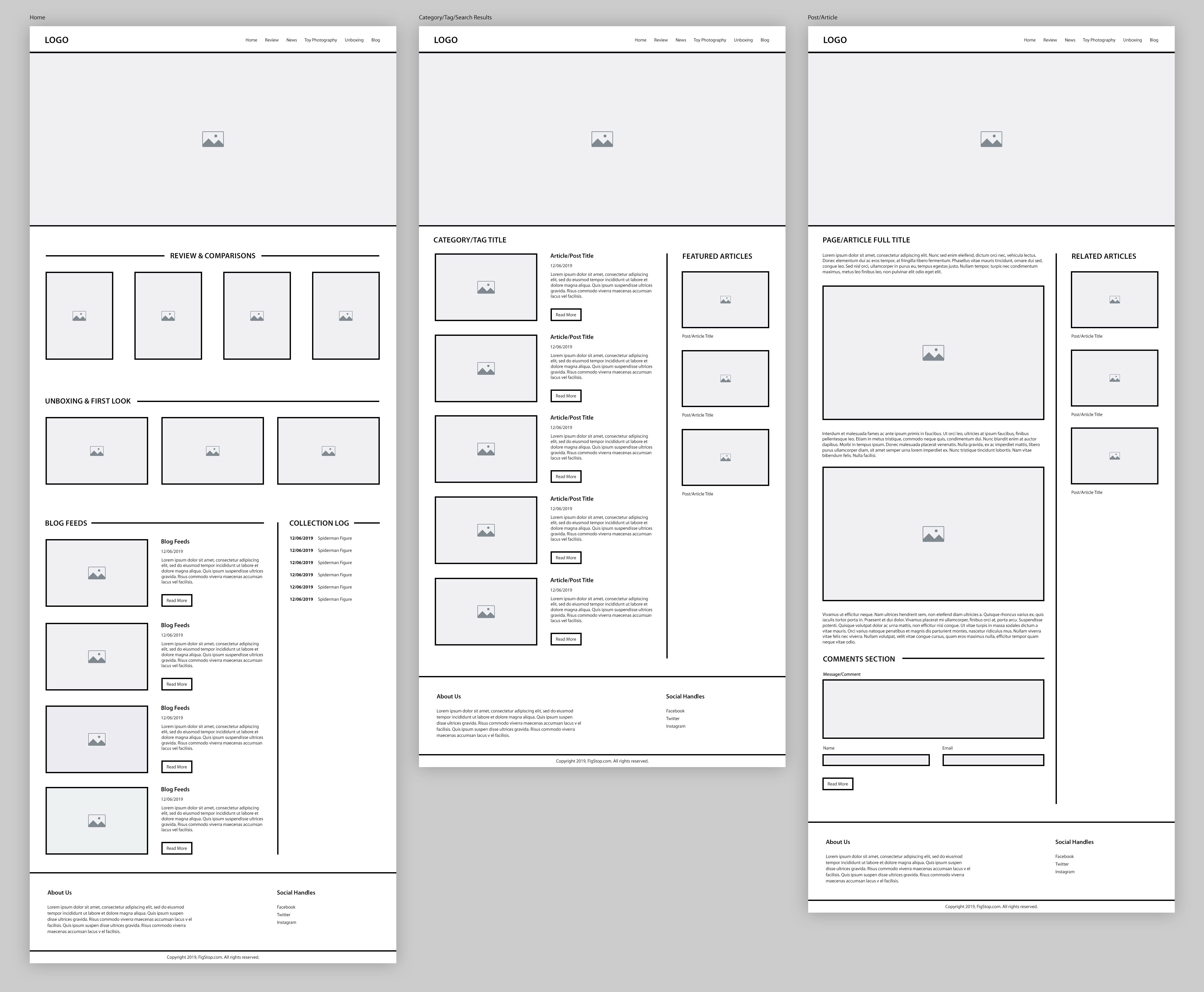
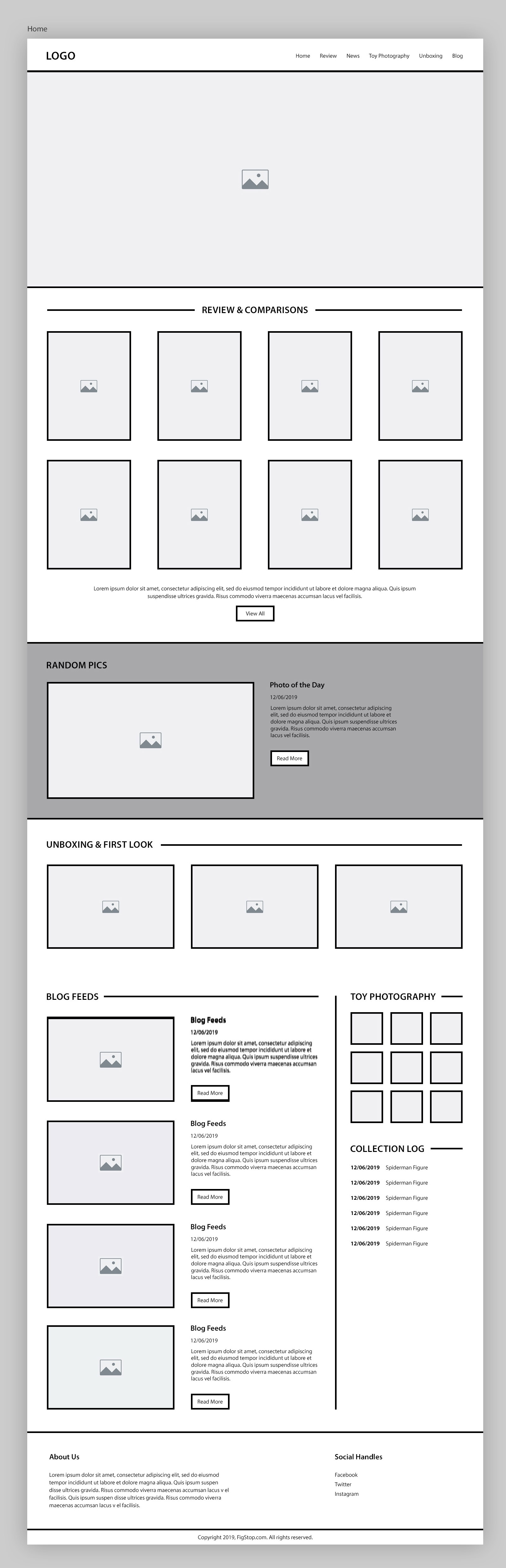
Based on the feedback collected, final wireframe for the home page was created, which basically had two new component (photography grid and random display of photos from collection) added to it, both around the toy photography, which I am very passionate about! This also broke the monotony and added the much needed playful touch. Also the review number went up from four to eight, making it the most sorted section in the entire page.
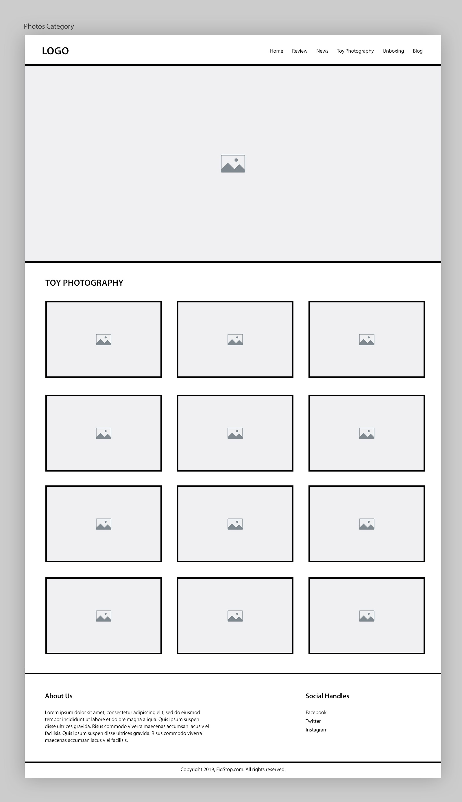
Also as per the feedback, the category listing page for showing off “Toy Photography” need to have a separate UX as it’s content is more visual in comparison to other content. So I created all thumbnail like structure like Instagram and it solved the issue. This like most other pages has the same header, hero and footer layout for branding consistency.
Visual Design:
Once the structure was solid, I transitioned into visual design in Adobe Photoshop, layering in brand colors, typography and imagery to bring in the playful personality and polish to the interface. Each visual choice was guided by the original wireframe logic and the feedback received. As always, ensuring that the design remained both aesthetically appealing, user-friendly and it passes all accessibility checks. As always, I started by designing the mobile screens first.
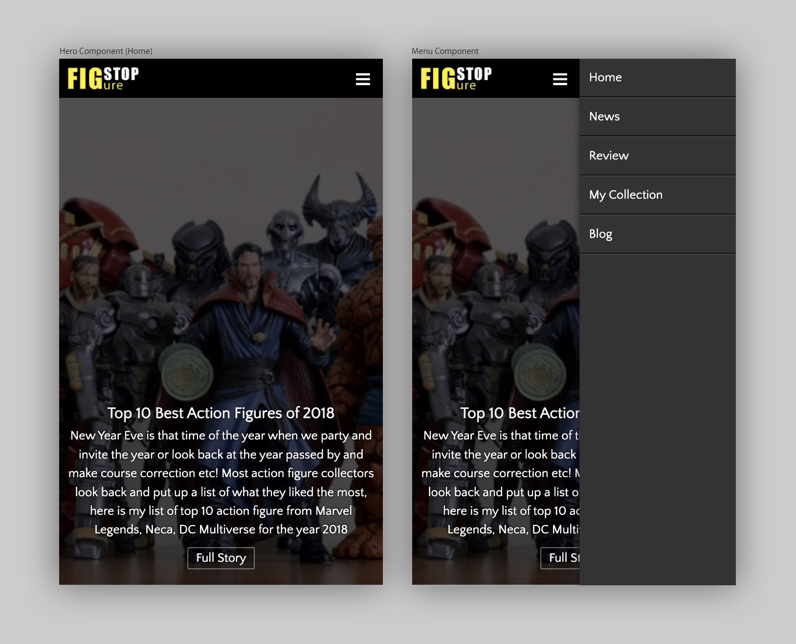
I took a slightly different approach designing the mobile UI, yeah instead of designing the screens, I designed component separately as it saved a lot of time. I took this approach as all the mobile component are designed to fit in 4 column so this could work, and it worked as planned. I could do get more screens out faster. Hero component is a simple 4 column full bleed banned with a CTA and brief, which helps SEO and also put a point.
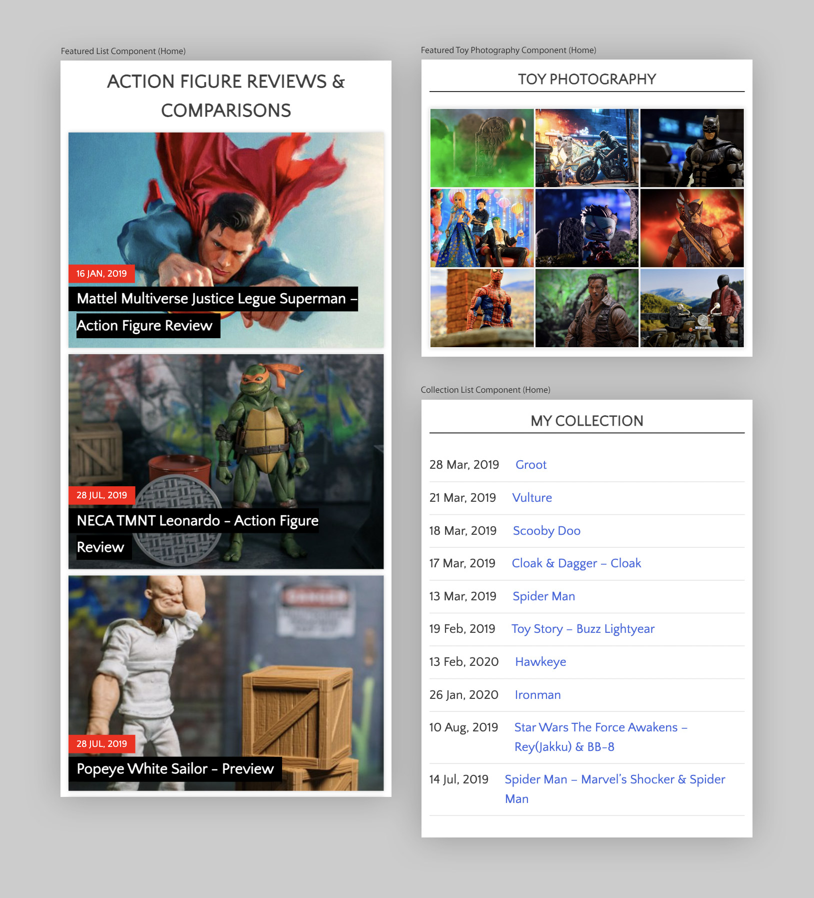
The home page has multiple list component like the “Review”, “Unboxing”, “Blog Feed”, “My Collection” and even “Toy Photography” so to break the monotony, I switched styles to make every one unique, the toy photography being a media heavy category gets its own Instagram style 3×3 component. The my collection section also puts just title and date giving it a list like UX.
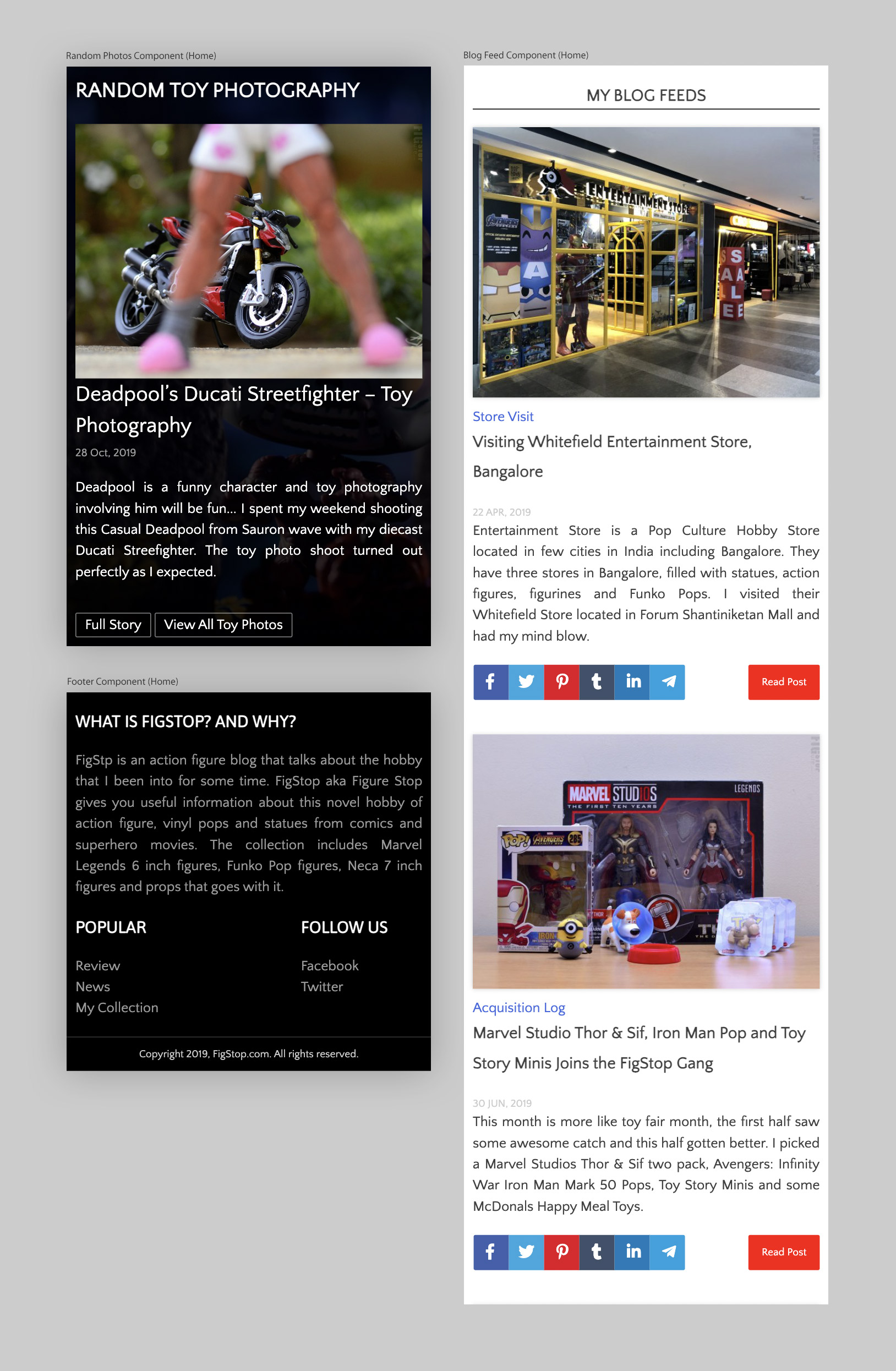
Finally, to add more interest to the otherwise layout is the “Random Toy Photography”, a full bleed dark background section, which houses a randomly selected photo, its title and brief. It also has two CTAs to explore this photo and also to explore the Toy Photography section. There is a blog feeds section, which follows a generic blog post style to give that simple yet functional layout. Footer has two section, one for the site description and other for category list and social linking.
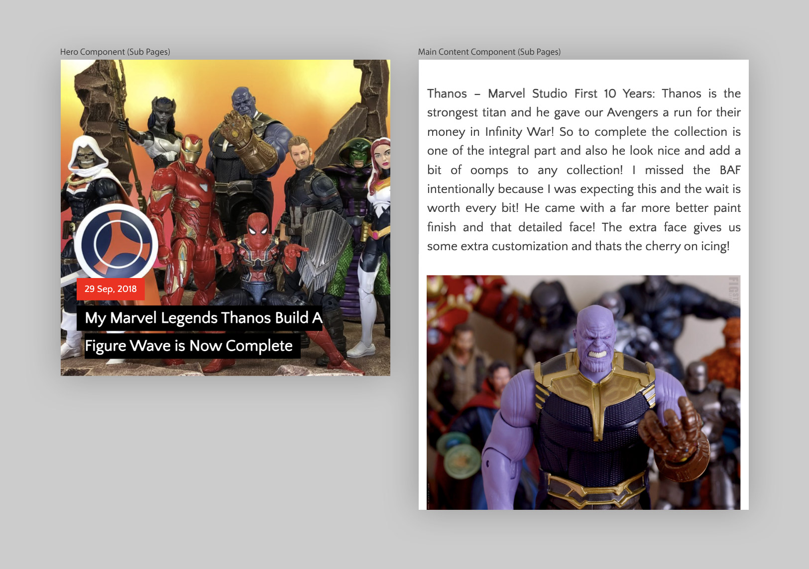
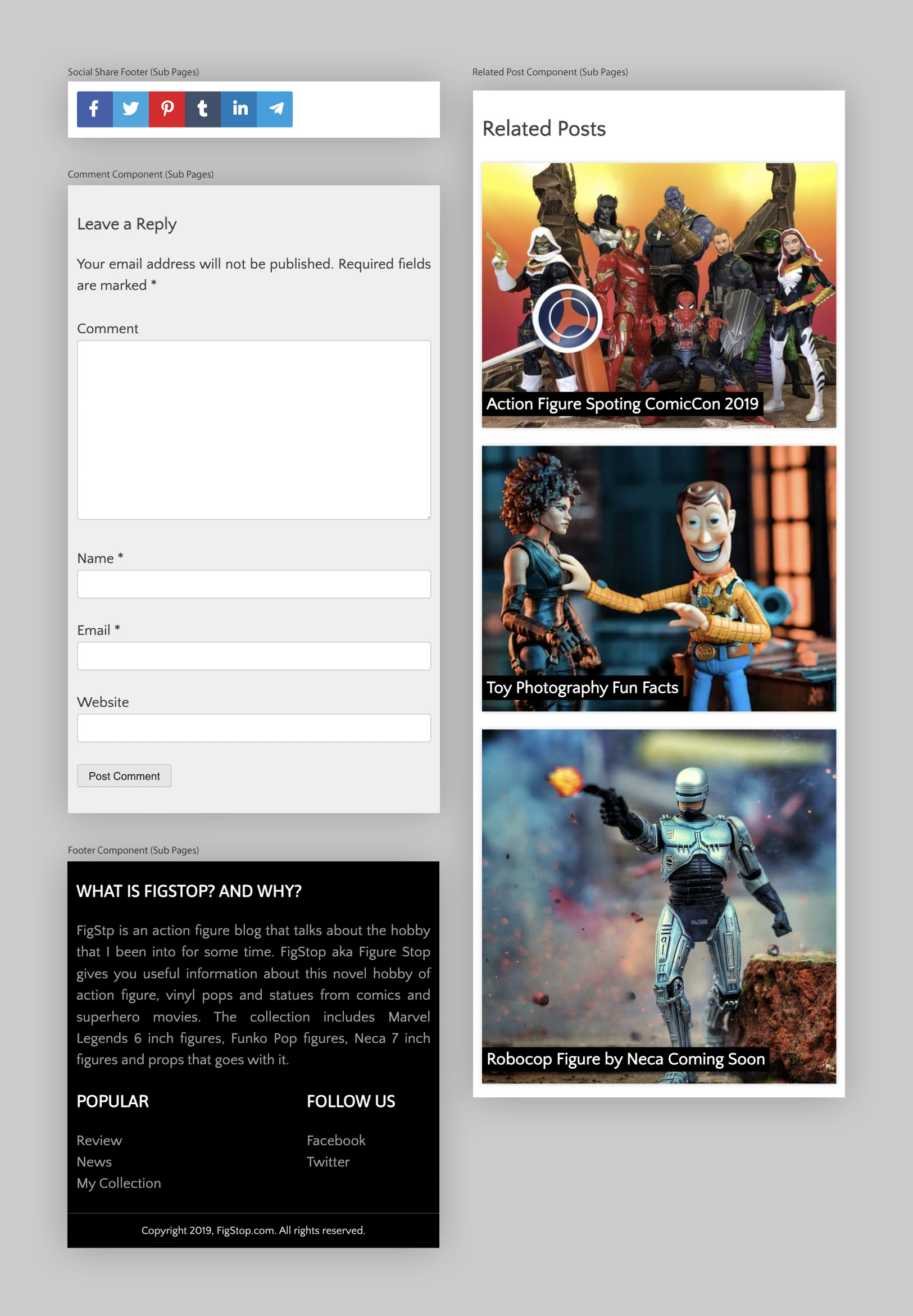
The sub-page is basically a striped version of the home page. The hero is a bit basic and the content is all one column where the images extending full width. There is a “Related Posts” section to increase conversion rate. As a norm I added a generic commenting section for user to share their thoughts. The footer is identical as the home.
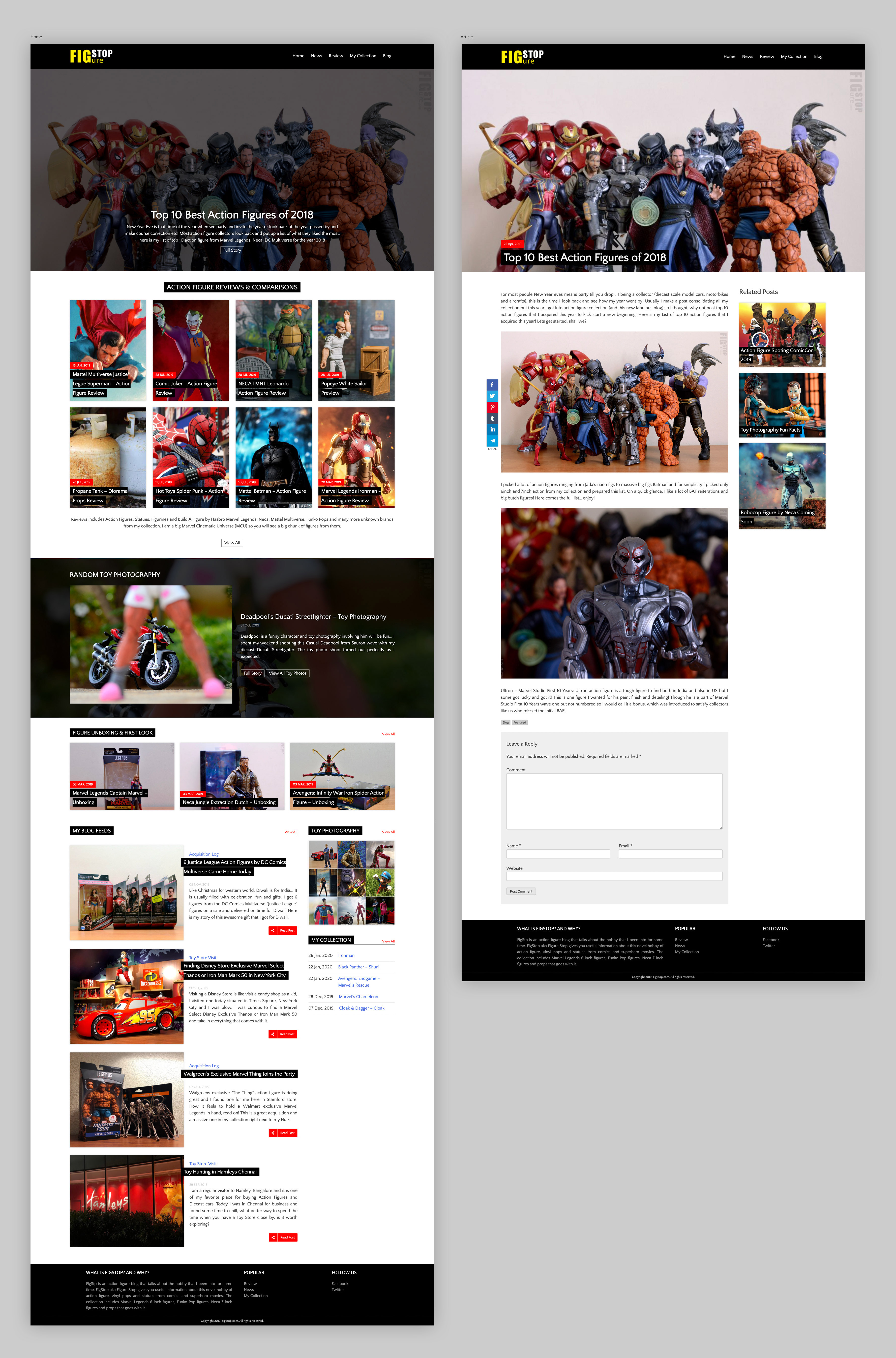
The desktop UI is a high-fidelity version of the wireframe that we used for initial feedback collection session. This helped me to speed up the development. The design language is same as the mobile version extended to 12 column. The major difference is the background for the “Random Toy Photography”, which is a same thumbnail but with a black tint to make the main photo stand out. I also planned a bit of hover transition effect to make it visually interesting.
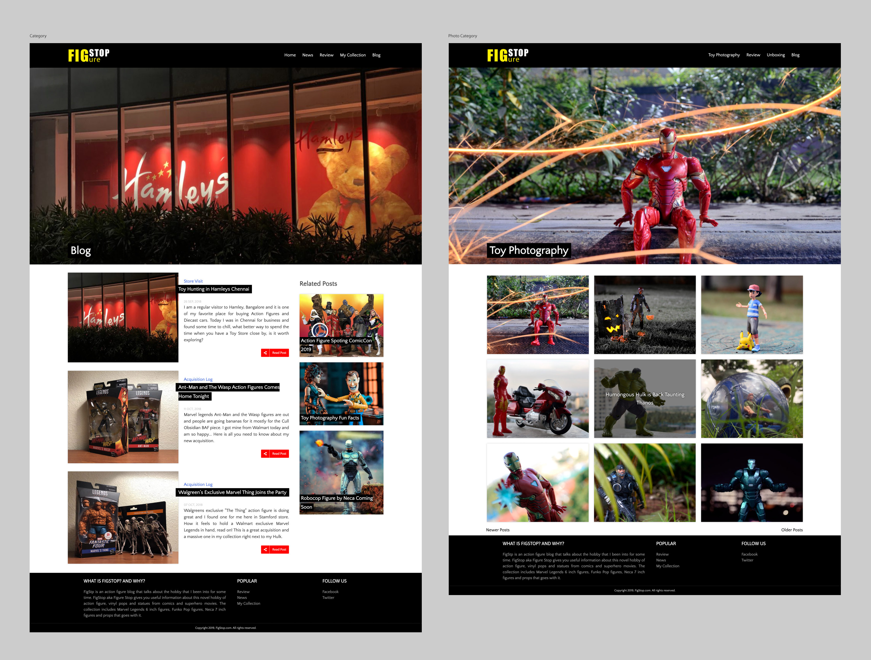
The category section gets some love with a slight deviation from the initial wireframe layout to match with the home page. The toy photography category gets a transition effect on hover, which also reveals the title of the photo. All the hero for the category is picked up from the category listed.
Test & Iterate
No design is perfect on the first try — that’s why testing is essential. Once the initial design prototypes were ready, I conducted usability tests with representative users to see how they interacted with the interface in real scenarios. The goal was to validate key elements such as navigation flow, content hierarchy and overall ease of use.
This test-and-iterate cycle not only improved usability but also increased user confidence and engagement, resulting in a design that felt intuitive from the first interaction. By the time the product launched, it had already been shaped by the very people it was built for.
Learnings:
This journey reminded me again that effective UI/UX development is about blending visual storytelling with functional design, creating websites that feel effortless to use while remaining true to the brand. Each project helped me understand not just how to make a WordPress site look good, but how to make it intuitive, load fast and accessible.